Azwar's Blog
Responsive Web Design: Creating Mobile-First Websites with CSS and JavaScript
Hi everyone! I'm Azwar, a WordPress and frontend developer passionate about creating responsive websites. In this comprehensive guide, I'll walk you through responsive web design techniques using a mobile-first approach. Responsive design is essential for providing excellent user experience across all devices.
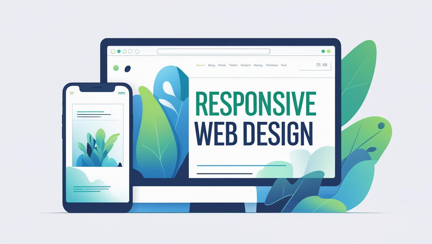
Responsive web design ensures that your websites look and function perfectly on desktops, tablets, and mobile devices. With the increasing use of mobile devices for web browsing, creating responsive websites is no longer optional—it's essential.
Understanding Responsive Design Principles
Mobile-First Approach
The mobile-first approach means designing for mobile devices first, then progressively enhancing for larger screens. This approach ensures better performance and user experience.
Breakpoints Strategy
/* Mobile First - Base styles for mobile */
.container {
    width: 100%;
    padding: 0 15px;
    margin: 0 auto;
}

/* Tablet - 768px and up */
@media (min-width: 768px) {
    .container {
        max-width: 720px;
    }
}

/* Desktop - 992px and up */
@media (min-width: 992px) {
    .container {
        max-width: 960px;
    }
}

/* Large Desktop - 1200px and up */
@media (min-width: 1200px) {
    .container {
        max-width: 1140px;
    }
}
CSS Grid for Responsive Layouts
1. Basic Grid Layout
/* Mobile-first grid system */
.grid {
    display: grid;
    gap: 1rem;
    grid-template-columns: 1fr;
    padding: 1rem;
}

/* Tablet */
@media (min-width: 768px) {
    .grid {
        grid-template-columns: repeat(2, 1fr);
        gap: 1.5rem;
    }
}

/* Desktop */
@media (min-width: 1024px) {
    .grid {
        grid-template-columns: repeat(3, 1fr);
        gap: 2rem;
    }
}

/* Large Desktop */
@media (min-width: 1200px) {
    .grid {
        grid-template-columns: repeat(4, 1fr);
    }
}
2. Advanced Grid Layouts
/* Complex responsive grid */
.responsive-layout {
    display: grid;
    gap: 1rem;
    grid-template-areas:
        "header"
        "sidebar"
        "main"
        "footer";
    grid-template-columns: 1fr;
    grid-template-rows: auto auto 1fr auto;
    min-height: 100vh;
}

/* Tablet layout */
@media (min-width: 768px) {
    .responsive-layout {
        grid-template-areas:
            "header header"
            "sidebar main"
            "footer footer";
        grid-template-columns: 250px 1fr;
        grid-template-rows: auto 1fr auto;
    }
}

/* Desktop layout */
@media (min-width: 1024px) {
    .responsive-layout {
        grid-template-areas:
            "header header header"
            "sidebar main aside"
            "footer footer footer";
        grid-template-columns: 250px 1fr 300px;
    }
}

/* Apply grid areas */
.header { grid-area: header; }
.sidebar { grid-area: sidebar; }
.main { grid-area: main; }
.aside { grid-area: aside; }
.footer { grid-area: footer; }
3. Responsive Card Grid
/* Responsive card layout */
.card-grid {
    display: grid;
    gap: 1rem;
    grid-template-columns: repeat(auto-fit, minmax(280px, 1fr));
    padding: 1rem;
}

.card {
    background: white;
    border-radius: 8px;
    box-shadow: 0 2px 4px rgba(0, 0, 0, 0.1);
    overflow: hidden;
    transition: transform 0.3s ease, box-shadow 0.3s ease;
}

.card:hover {
    transform: translateY(-4px);
    box-shadow: 0 8px 16px rgba(0, 0, 0, 0.15);
}

.card-image {
    width: 100%;
    height: 200px;
    object-fit: cover;
}

.card-content {
    padding: 1rem;
}

.card-title {
    font-size: 1.25rem;
    font-weight: 600;
    margin-bottom: 0.5rem;
}

.card-text {
    color: #666;
    line-height: 1.6;
    margin-bottom: 1rem;
}

.card-button {
    background: #007bff;
    color: white;
    padding: 0.5rem 1rem;
    border: none;
    border-radius: 4px;
    cursor: pointer;
    transition: background 0.3s ease;
}

.card-button:hover {
    background: #0056b3;
}
Flexbox for Responsive Components
1. Responsive Navigation
/* Mobile-first navigation */
.navbar {
    background: #333;
    padding: 1rem;
    position: sticky;
    top: 0;
    z-index: 1000;
}

.nav-container {
    display: flex;
    justify-content: space-between;
    align-items: center;
    max-width: 1200px;
    margin: 0 auto;
}

.nav-brand {
    color: white;
    font-size: 1.5rem;
    font-weight: bold;
    text-decoration: none;
}

.nav-menu {
    display: none;
    position: absolute;
    top: 100%;
    left: 0;
    right: 0;
    background: #333;
    flex-direction: column;
    padding: 1rem;
}

.nav-menu.active {
    display: flex;
}

.nav-item {
    margin: 0.5rem 0;
}

.nav-link {
    color: white;
    text-decoration: none;
    padding: 0.5rem;
    display: block;
    transition: color 0.3s ease;
}

.nav-link:hover {
    color: #007bff;
}

.nav-toggle {
    display: block;
    background: none;
    border: none;
    color: white;
    font-size: 1.5rem;
    cursor: pointer;
}

/* Desktop navigation */
@media (min-width: 768px) {
    .nav-menu {
        display: flex;
        position: static;
        background: none;
        flex-direction: row;
        padding: 0;
    }

    .nav-item {
        margin: 0 1rem;
    }

    .nav-toggle {
        display: none;
    }
}
2. Responsive Hero Section
/* Mobile-first hero section */
.hero {
    background: linear-gradient(135deg, #667eea 0%, #764ba2 100%);
    color: white;
    padding: 2rem 1rem;
    text-align: center;
    min-height: 60vh;
    display: flex;
    align-items: center;
    justify-content: center;
}

.hero-content {
    max-width: 600px;
    margin: 0 auto;
}

.hero-title {
    font-size: 2rem;
    font-weight: bold;
    margin-bottom: 1rem;
    line-height: 1.2;
}

.hero-subtitle {
    font-size: 1.1rem;
    margin-bottom: 2rem;
    opacity: 0.9;
    line-height: 1.6;
}

.hero-buttons {
    display: flex;
    flex-direction: column;
    gap: 1rem;
    align-items: center;
}

.btn {
    padding: 0.75rem 1.5rem;
    border: none;
    border-radius: 4px;
    font-size: 1rem;
    cursor: pointer;
    text-decoration: none;
    display: inline-block;
    transition: all 0.3s ease;
}

.btn-primary {
    background: #007bff;
    color: white;
}

.btn-primary:hover {
    background: #0056b3;
    transform: translateY(-2px);
}

.btn-secondary {
    background: transparent;
    color: white;
    border: 2px solid white;
}

.btn-secondary:hover {
    background: white;
    color: #333;
}

/* Tablet hero */
@media (min-width: 768px) {
    .hero {
        padding: 4rem 2rem;
        min-height: 70vh;
    }

    .hero-title {
        font-size: 2.5rem;
    }

    .hero-buttons {
        flex-direction: row;
        justify-content: center;
    }
}

/* Desktop hero */
@media (min-width: 1024px) {
    .hero {
        padding: 6rem 2rem;
        min-height: 80vh;
    }

    .hero-title {
        font-size: 3rem;
    }

    .hero-subtitle {
        font-size: 1.25rem;
    }
}
3. Responsive Form Layout
/* Mobile-first form */
.form-container {
    max-width: 600px;
    margin: 2rem auto;
    padding: 1rem;
}

.form {
    background: white;
    padding: 1.5rem;
    border-radius: 8px;
    box-shadow: 0 2px 8px rgba(0, 0, 0, 0.1);
}

.form-group {
    margin-bottom: 1.5rem;
}

.form-label {
    display: block;
    margin-bottom: 0.5rem;
    font-weight: 500;
    color: #333;
}

.form-input {
    width: 100%;
    padding: 0.75rem;
    border: 1px solid #ddd;
    border-radius: 4px;
    font-size: 1rem;
    transition: border-color 0.3s ease;
}

.form-input:focus {
    outline: none;
    border-color: #007bff;
    box-shadow: 0 0 0 2px rgba(0, 123, 255, 0.25);
}

.form-row {
    display: flex;
    flex-direction: column;
    gap: 1rem;
}

.form-submit {
    width: 100%;
    background: #007bff;
    color: white;
    padding: 0.75rem;
    border: none;
    border-radius: 4px;
    font-size: 1rem;
    cursor: pointer;
    transition: background 0.3s ease;
}

.form-submit:hover {
    background: #0056b3;
}

/* Tablet form */
@media (min-width: 768px) {
    .form {
        padding: 2rem;
    }

    .form-row {
        flex-direction: row;
    }

    .form-row .form-group {
        flex: 1;
    }
}
JavaScript for Responsive Interactions
1. Mobile Navigation Toggle
// Mobile navigation functionality
class ResponsiveNavigation {
    constructor() {
        this.navToggle = document.querySelector('.nav-toggle');
        this.navMenu = document.querySelector('.nav-menu');
        this.navLinks = document.querySelectorAll('.nav-link');

        this.init();
    }

    init() {
        this.navToggle.addEventListener('click', () => {
            this.toggleMenu();
        });

        // Close menu when clicking on links
        this.navLinks.forEach(link => {
            link.addEventListener('click', () => {
                this.closeMenu();
            });
        });

        // Close menu on window resize
        window.addEventListener('resize', () => {
            if (window.innerWidth >= 768) {
                this.closeMenu();
            }
        });
    }

    toggleMenu() {
        this.navMenu.classList.toggle('active');
        this.navToggle.setAttribute('aria-expanded',
            this.navMenu.classList.contains('active'));
    }

    closeMenu() {
        this.navMenu.classList.remove('active');
        this.navToggle.setAttribute('aria-expanded', 'false');
    }
}

// Initialize navigation
document.addEventListener('DOMContentLoaded', () => {
    new ResponsiveNavigation();
});
2. Responsive Image Gallery
// Responsive image gallery class ResponsiveGallery { constructor(container) { this.container = container; this.images = container.querySelectorAll('.gallery-item'); this.currentIndex = 0; this.init(); } init() { this.setupGrid(); this.setupLightbox(); this.handleResize(); window.addEventListener('resize', () => { this.handleResize(); }); } setupGrid() { this.images.forEach((image, index) => { image.addEventListener('click', () => { this.openLightbox(index); }); }); } setupLightbox() { this.lightbox = document.createElement('div'); this.lightbox.className = 'lightbox'; this.lightbox.innerHTML = ` <div class="lightbox-content"> <button class="lightbox-close">×</button> <button class="lightbox-prev"><</button> <button class="lightbox-next">></button> <img class="lightbox-image" src="" alt=""> </div> `; document.body.appendChild(this.lightbox); this.lightbox.querySelector('.lightbox-close').addEventListener('click', () => { this.closeLightbox(); }); this.lightbox.querySelector('.lightbox-prev').addEventListener('click', () => { this.prevImage(); }); this.lightbox.querySelector('.lightbox-next').addEventListener('click', () => { this.nextImage(); }); this.lightbox.addEventListener('click', (e) => { if (e.target === this.lightbox) { this.closeLightbox(); } }); } openLightbox(index) { this.currentIndex = index; const image = this.images[index]; const lightboxImage = this.lightbox.querySelector('.lightbox-image'); lightboxImage.src = image.querySelector('img').src; lightboxImage.alt = image.querySelector('img').alt; this.lightbox.classList.add('active'); document.body.style.overflow = 'hidden'; } closeLightbox() { this.lightbox.classList.remove('active'); document.body.style.overflow = ''; } prevImage() { this.currentIndex = (this.currentIndex - 1 + this.images.length) % this.images.length; this.updateLightboxImage(); } nextImage() { this.currentIndex = (this.currentIndex + 1) % this.images.length; this.updateLightboxImage(); } updateLightboxImage() { const image = this.images[this.currentIndex]; const lightboxImage = this.lightbox.querySelector('.lightbox-image'); lightboxImage.src = image.querySelector('img').src; lightboxImage.alt = image.querySelector('img').alt; } handleResize() { const columns = this.getColumnsCount(); this.container.style.gridTemplateColumns = `repeat(${columns}, 1fr)`; } getColumnsCount() { const width = window.innerWidth; if (width < 768) return 1; if (width < 1024) return 2; if (width < 1200) return 3; return 4; } } // Initialize gallery document.addEventListener('DOMContentLoaded', () => { const galleries = document.querySelectorAll('.gallery'); galleries.forEach(gallery => { new ResponsiveGallery(gallery); }); });
3. Responsive Data Table
// Responsive data table
class ResponsiveTable {
    constructor(table) {
        this.table = table;
        this.headers = Array.from(table.querySelectorAll('th'));
        this.rows = Array.from(table.querySelectorAll('tbody tr'));

        this.init();
    }

    init() {
        this.setupResponsive();
        this.handleResize();

        window.addEventListener('resize', () => {
            this.handleResize();
        });
    }

    setupResponsive() {
        if (window.innerWidth < 768) {
            this.convertToCards();
        }
    }

    convertToCards() {
        this.rows.forEach(row => {
            const cells = Array.from(row.querySelectorAll('td'));
            const card = document.createElement('div');
            card.className = 'table-card';

            cells.forEach((cell, index) => {
                const label = this.headers[index]?.textContent || `Column ${index + 1}`;
                const value = cell.textContent;

                card.innerHTML += `
                    <div class="card-row">
                        <span class="card-label">${label}:</span>
                        <span class="card-value">${value}</span>
                    </div>
                `;
            });

            row.parentNode.insertBefore(card, row);
            row.style.display = 'none';
        });
    }

    convertToTable() {
        this.rows.forEach(row => {
            row.style.display = '';
        });

        const cards = this.table.parentNode.querySelectorAll('.table-card');
        cards.forEach(card => card.remove());
    }

    handleResize() {
        if (window.innerWidth < 768) {
            this.convertToCards();
        } else {
            this.convertToTable();
        }
    }
}

// Initialize responsive tables
document.addEventListener('DOMContentLoaded', () => {
    const tables = document.querySelectorAll('table');
    tables.forEach(table => {
        new ResponsiveTable(table);
    });
});
CSS for Responsive Tables
/* Responsive table styles */
.table-container {
    overflow-x: auto;
    margin: 1rem 0;
}

table {
    width: 100%;
    border-collapse: collapse;
    background: white;
    border-radius: 8px;
    overflow: hidden;
    box-shadow: 0 2px 8px rgba(0, 0, 0, 0.1);
}

th, td {
    padding: 0.75rem;
    text-align: left;
    border-bottom: 1px solid #eee;
}

th {
    background: #f8f9fa;
    font-weight: 600;
    color: #333;
}

tr:hover {
    background: #f8f9fa;
}

/* Mobile card layout */
.table-card {
    background: white;
    border: 1px solid #eee;
    border-radius: 8px;
    padding: 1rem;
    margin-bottom: 1rem;
    box-shadow: 0 2px 4px rgba(0, 0, 0, 0.1);
}

.card-row {
    display: flex;
    justify-content: space-between;
    align-items: center;
    padding: 0.5rem 0;
    border-bottom: 1px solid #eee;
}

.card-row:last-child {
    border-bottom: none;
}

.card-label {
    font-weight: 600;
    color: #666;
    min-width: 100px;
}

.card-value {
    color: #333;
    text-align: right;
}

/* Hide table on mobile */
@media (max-width: 767px) {
    table {
        display: none;
    }
}

/* Show table on larger screens */
@media (min-width: 768px) {
    .table-card {
        display: none;
    }
}
Best Practices for Responsive Design
- Mobile-First Approach: Start with mobile designs and scale up
- Use Relative Units: Prefer rem, em, and % over fixed pixels
- Flexible Images: Use max-width: 100% and height: auto
- Test on Real Devices: Don't rely solely on browser dev tools
- Performance Matters: Optimize images and minimize HTTP requests
- Touch-Friendly: Ensure buttons and links are at least 44px
- Readable Text: Maintain good contrast and font sizes
- Progressive Enhancement: Add features for larger screens
- Consistent Spacing: Use a consistent spacing system
- Accessibility: Ensure your responsive design is accessible
Conclusion
Responsive web design is essential for modern web development. By following the mobile-first approach and using CSS Grid, Flexbox, and JavaScript, you can create websites that provide excellent user experience across all devices.
Remember to test your responsive designs on various devices and screen sizes to ensure they work perfectly for all users.